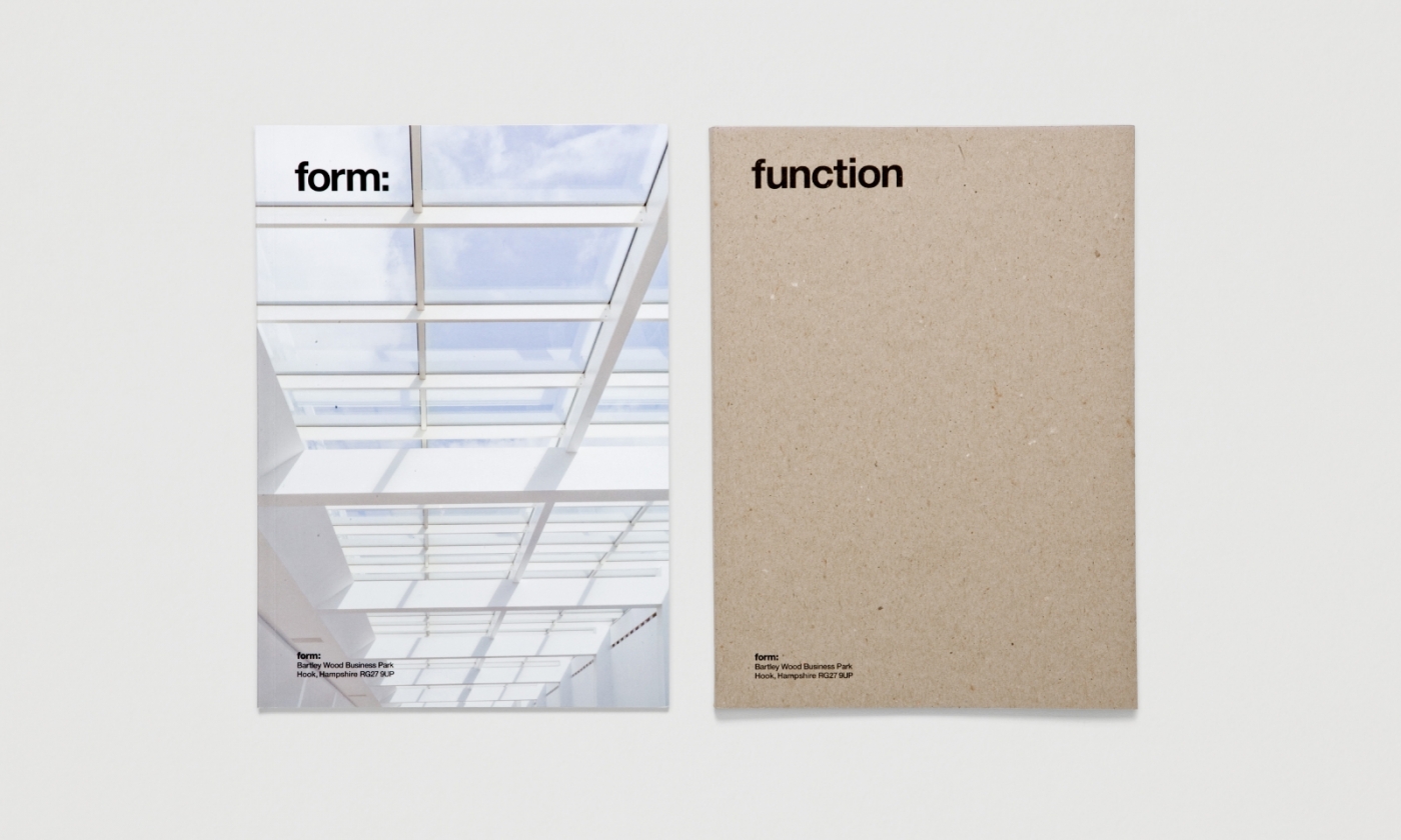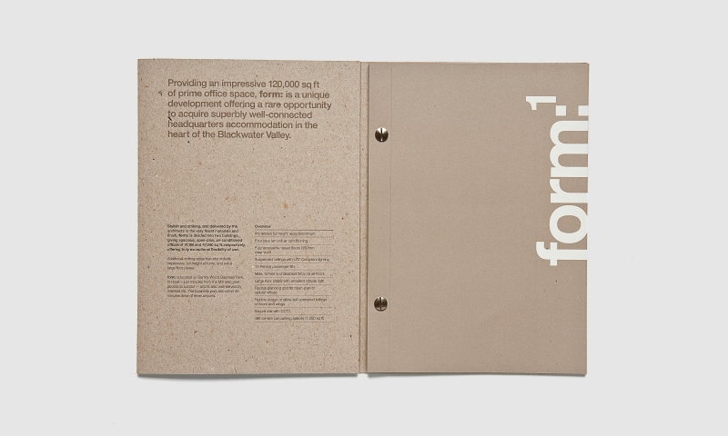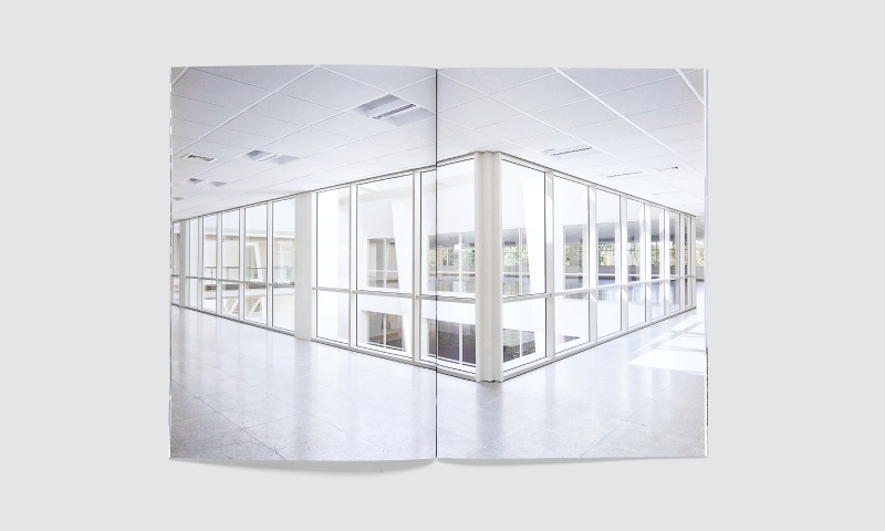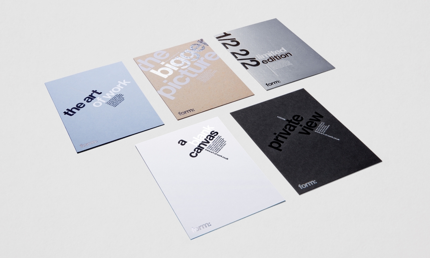
Naming, brand identity and marketing inspired by the striking modernist architecture of the buiding. The idea of ‘form following function’ was carried through into the naming of the building and used to communicate the benefits and potential of the property (‘form: partnerships’, ‘form: the future’, ‘form: an opinion’).
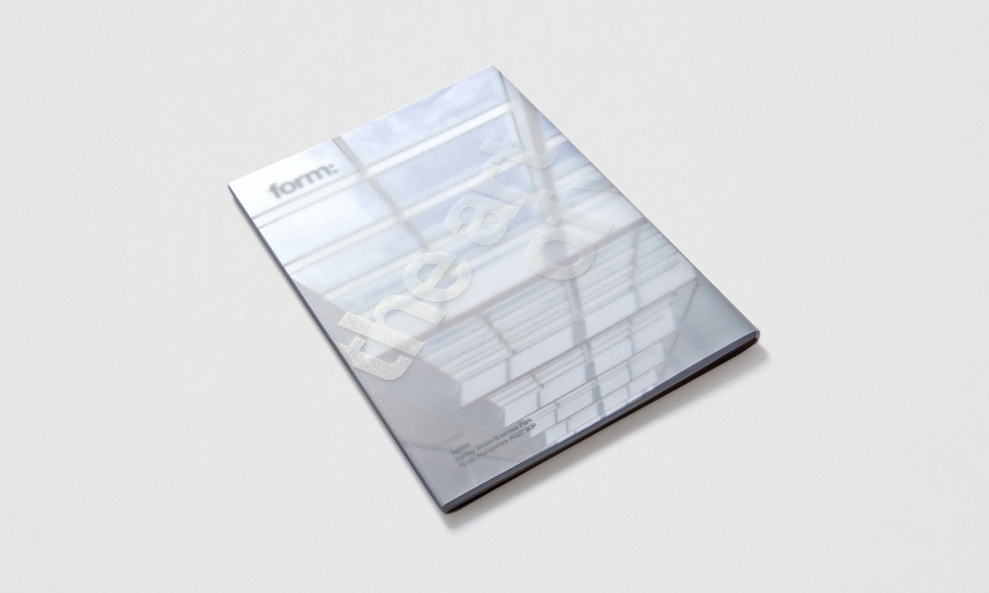
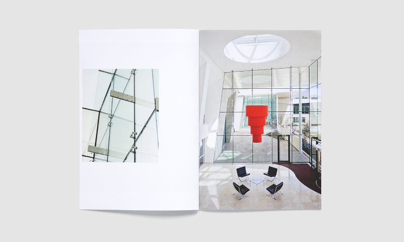
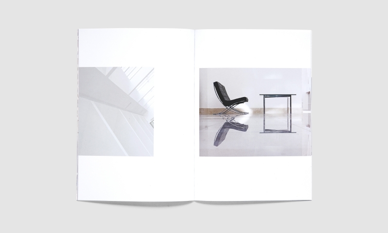
We took a modernist approach to the typography and layout of the visual identity. The marketing campaign, ‘The Art of Work’ uses bold sans serif typography, colours, materials and print techniques, which reference the finishes of the building.
Client
CIT