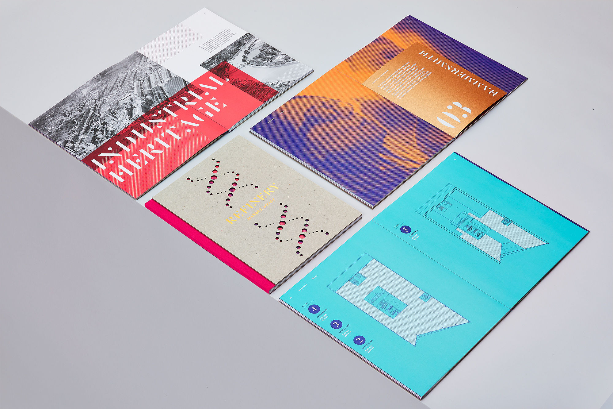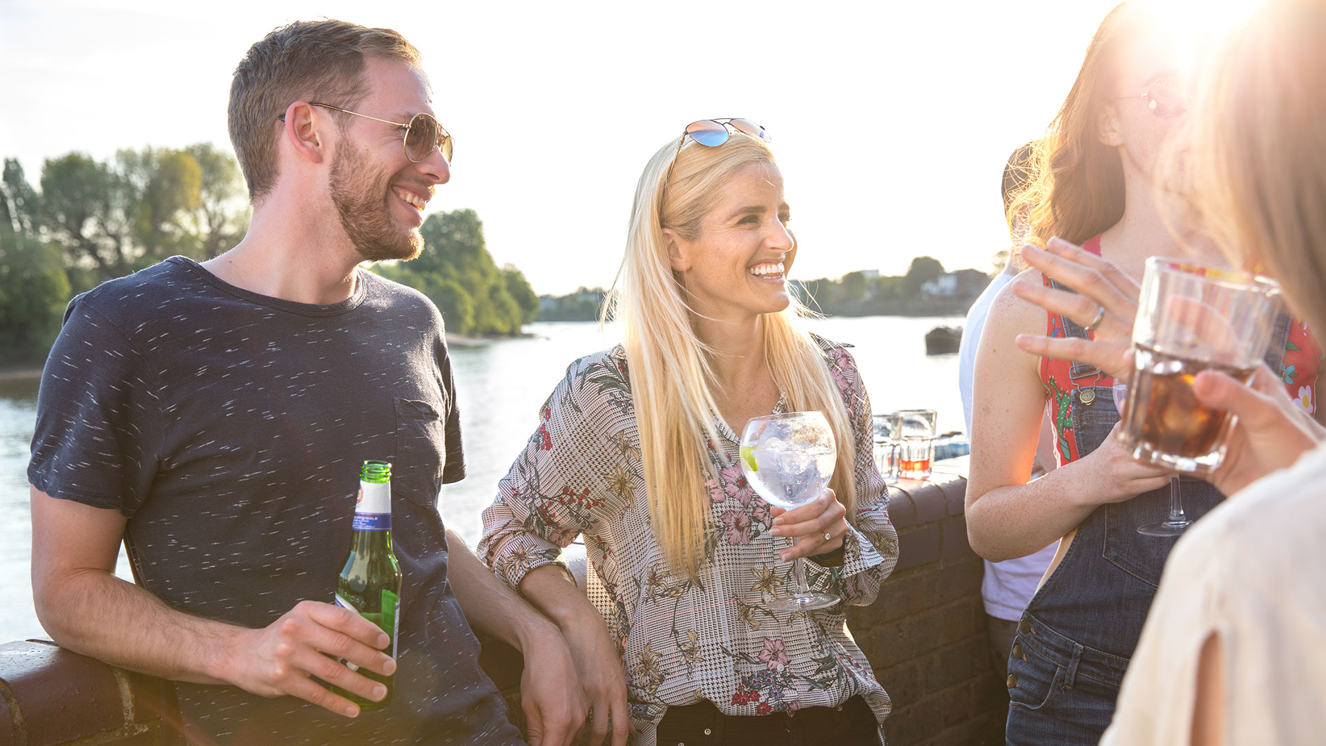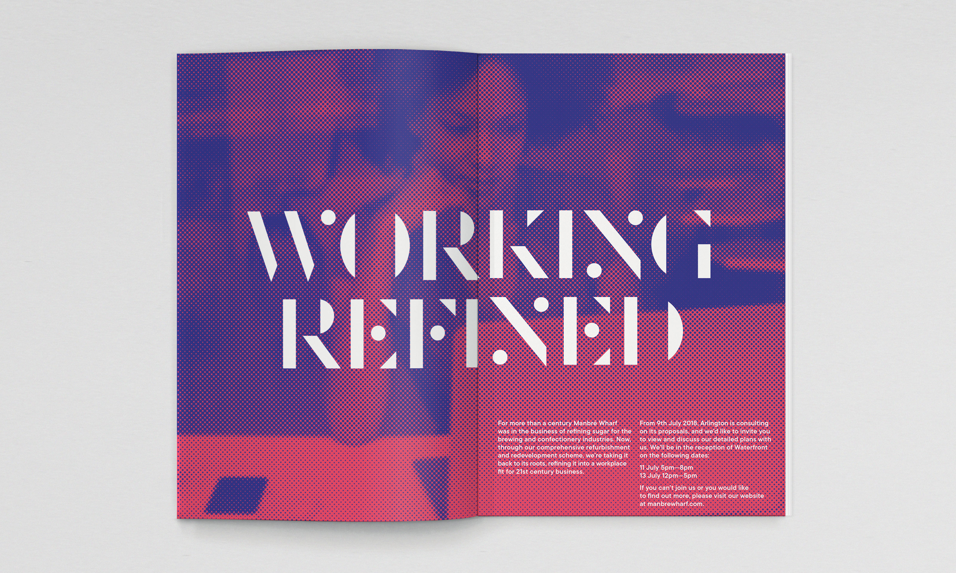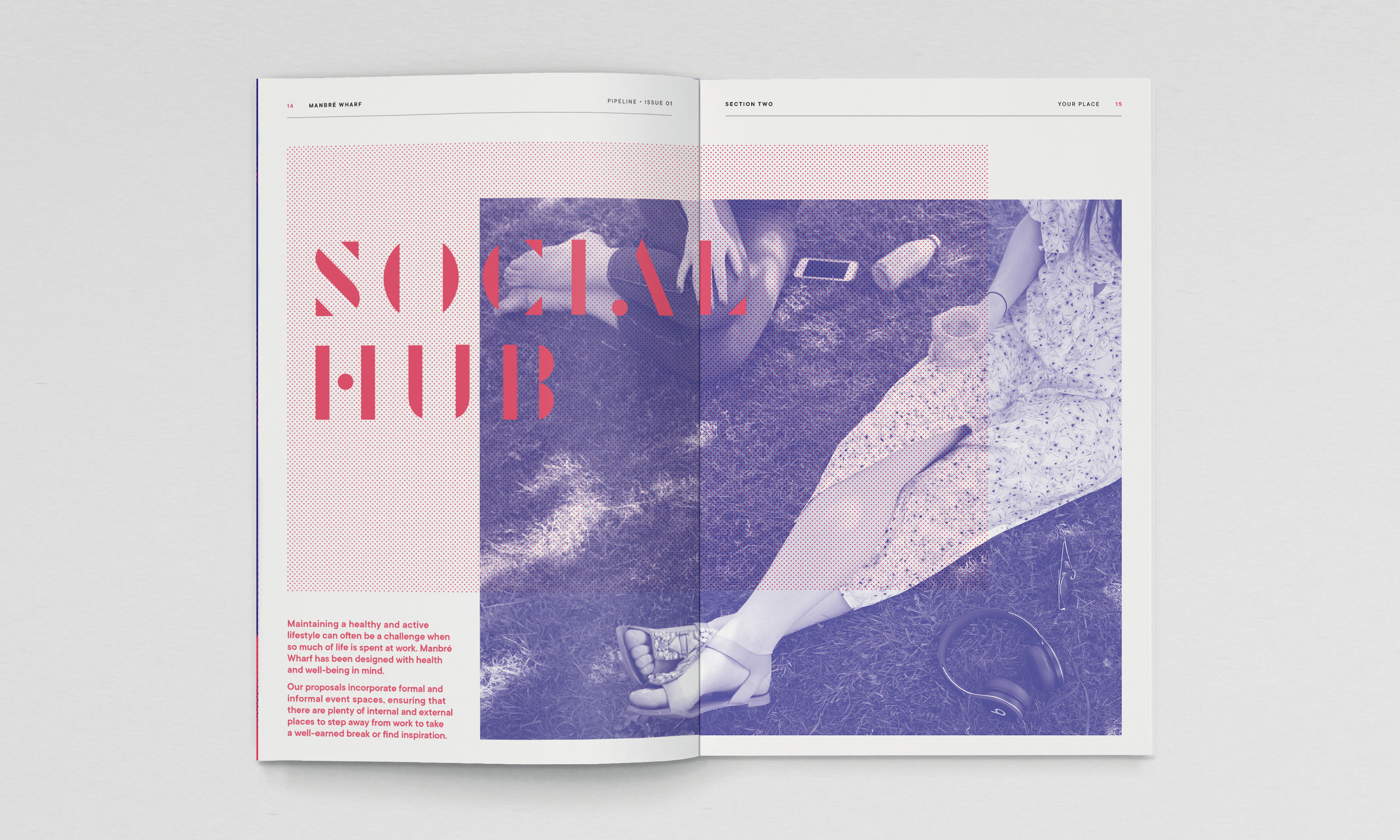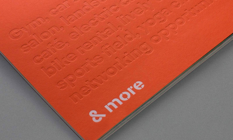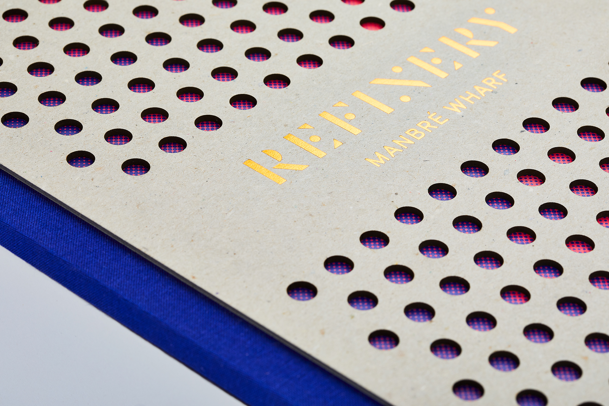
For more than a century this prestigious site on the banks of the Thames in Hammersmith was home to the Manbré & Garton sugar refinery. It is now undergoing a comprehensive redevelopment, taking it back to its roots and creating a workplace fit for 21st century business.
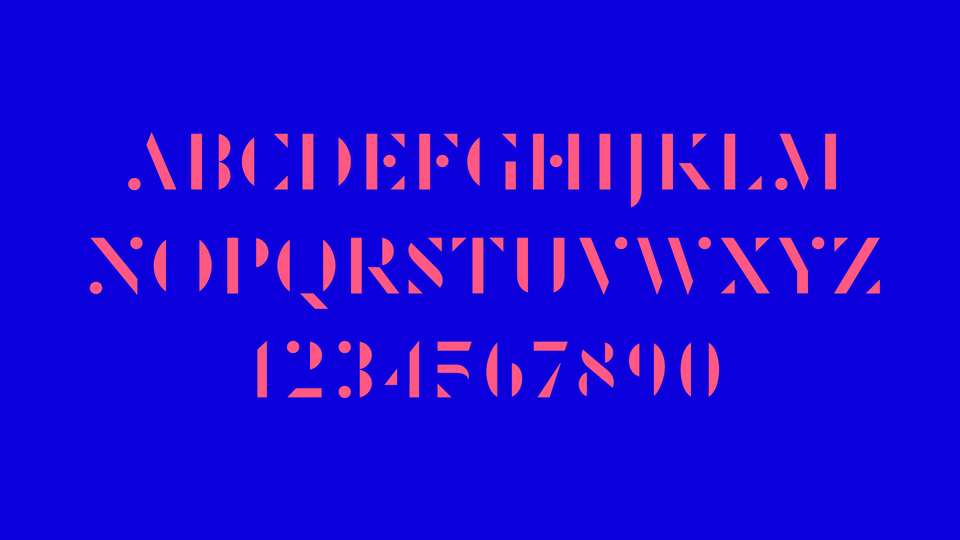
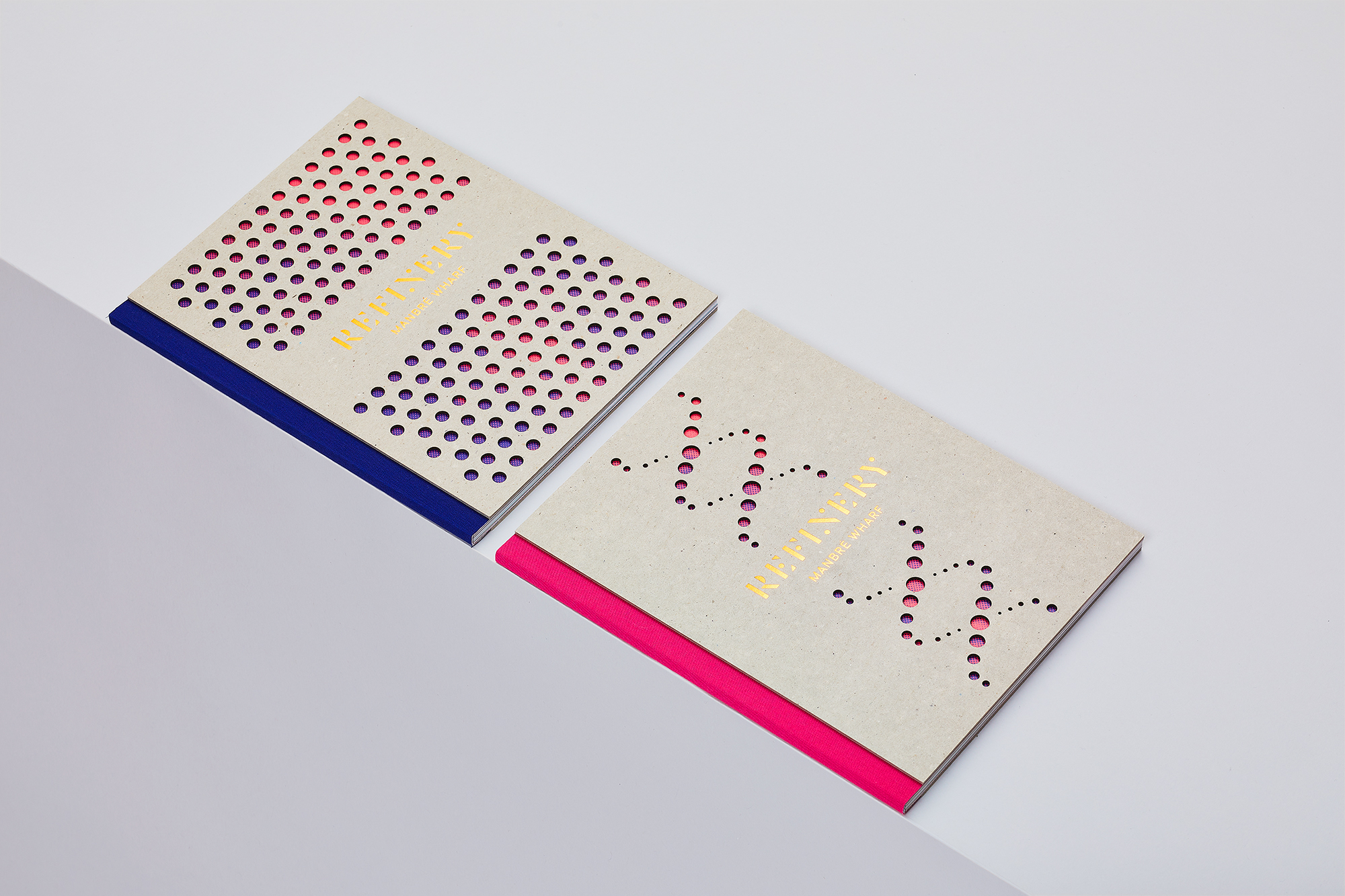
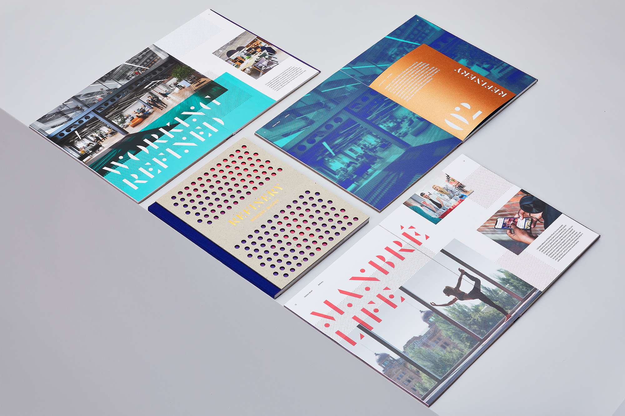
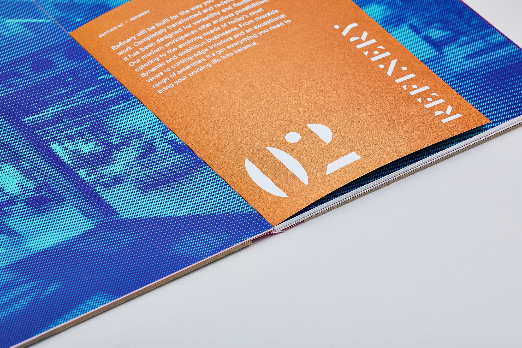
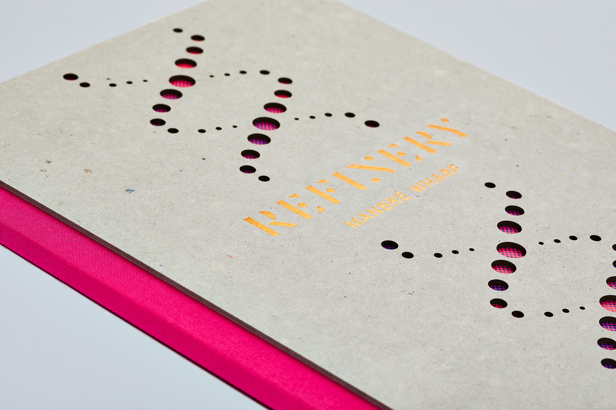
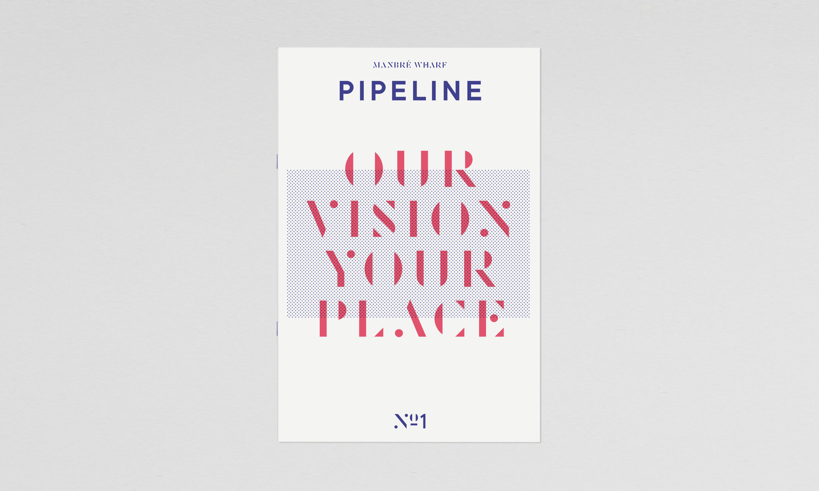
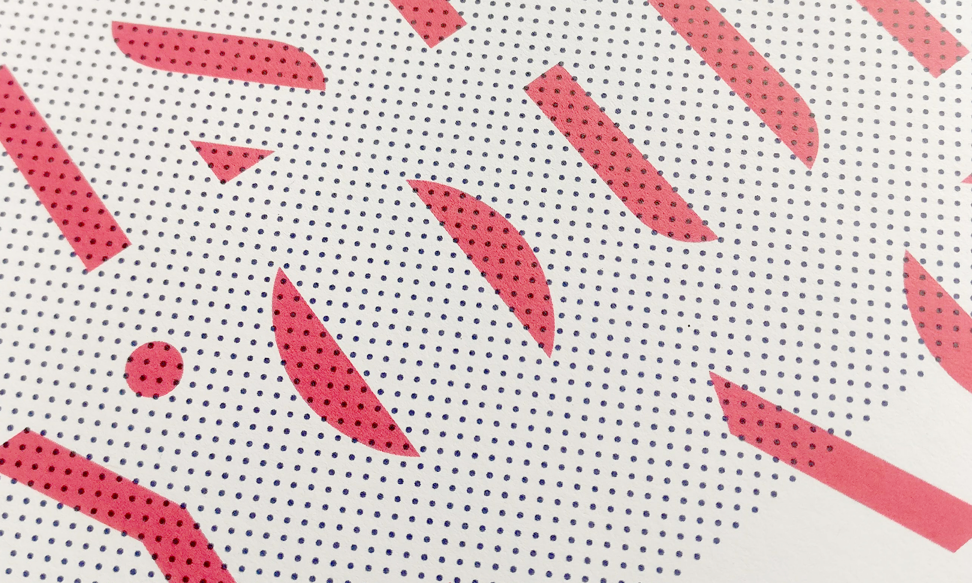
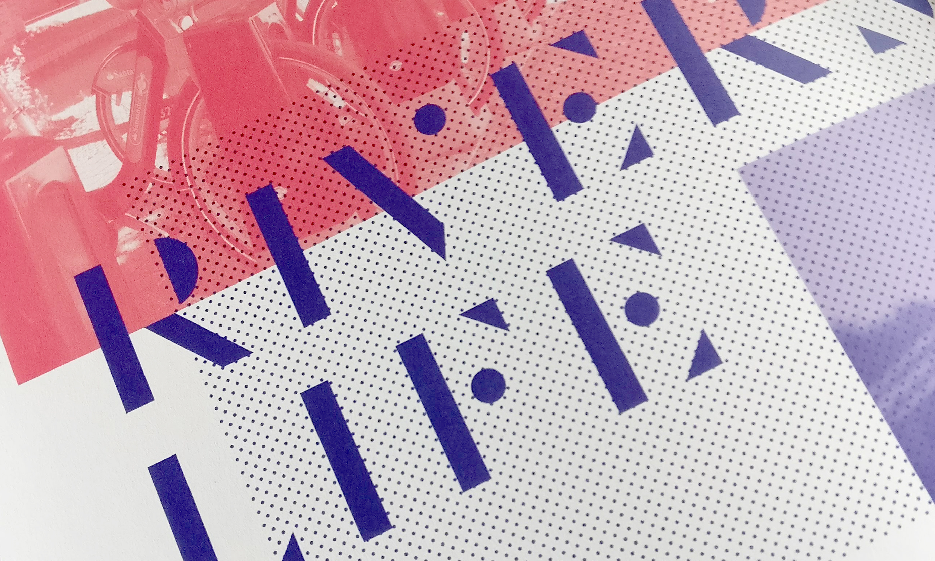
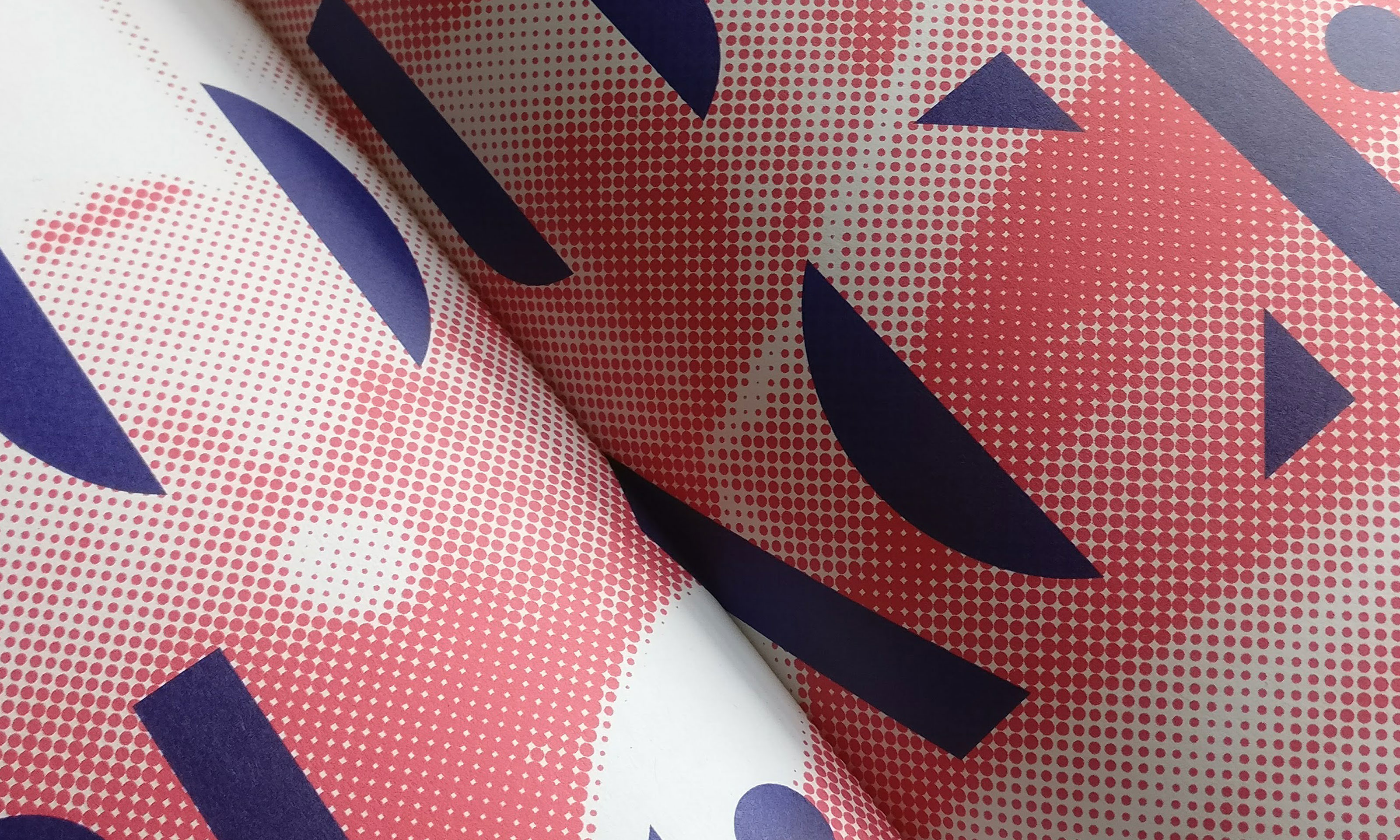
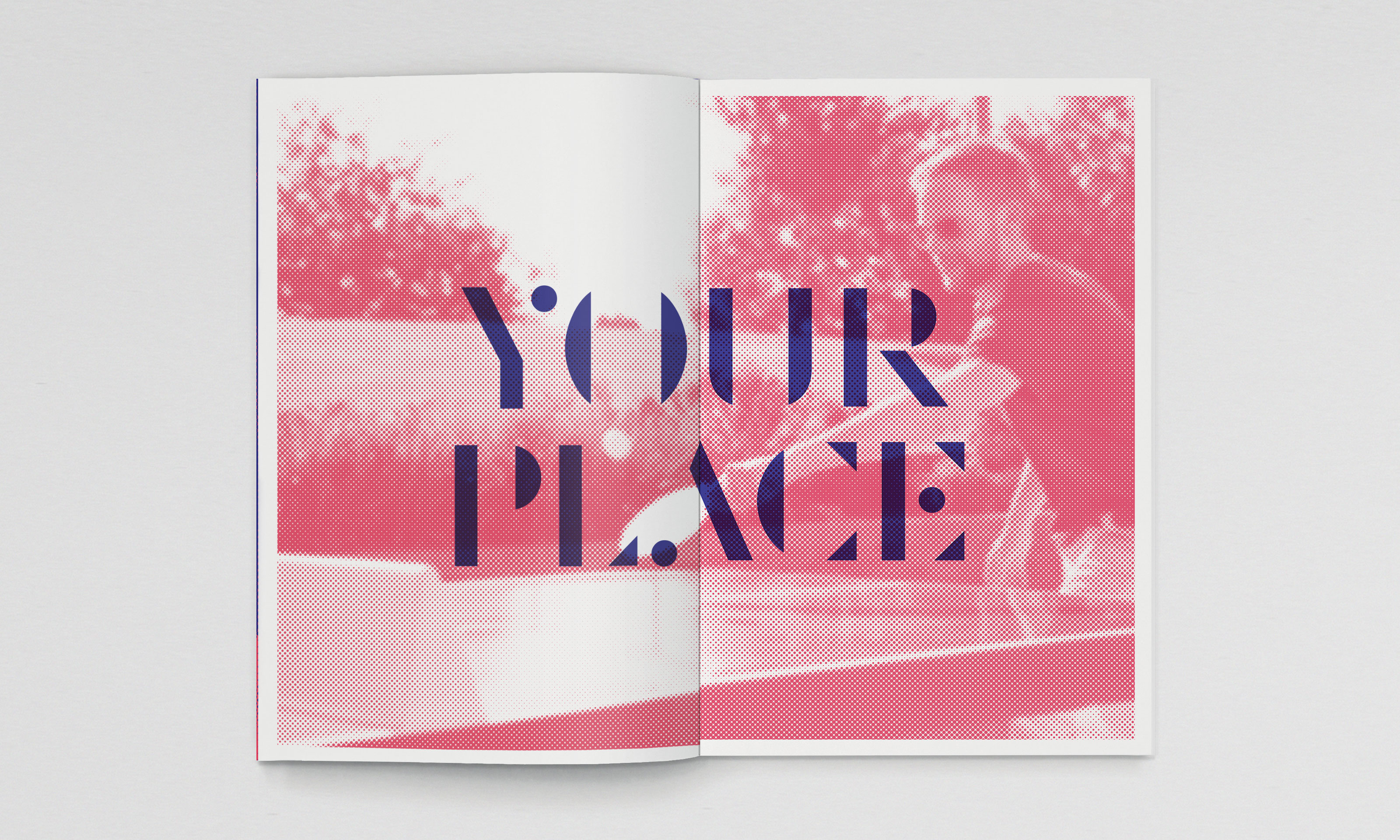
The brand is based on the concept of ‘Working Refined’, referencing the heritage of the saccharine works, and neatly encapsulating the vision of the scheme. The brand marque is created from a unique typeface which itself has been refined down to its most basic elements. The typeface, and the halftone style applied to brand imagery, reflect granules and project the ‘work in progress’ nature of the development which is due to complete in 2020. In digital applications the refining concept is delivered visually through animating images and typography.
Client
Links
Credits
Photography: Fernando Manoso
Copywriting: Serious Oomph!
Film & animation: Nipple
Website build: Archive
Print: Gavin Martin Colournet